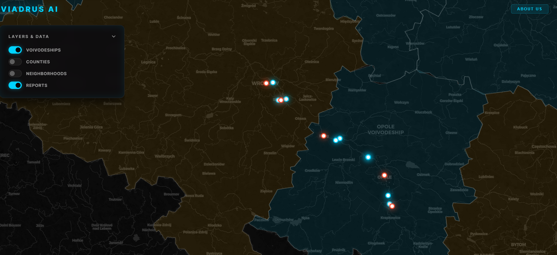
ViadrusAI
Satellite-based early-warning tool for water pipeline leaks
- 0 Raised
- 2,085 Views
- 0 Judges
Team
Tags
Categories
Gallery


Description
ViadrusAI Team intends to create a satellite-based early-warning tool for water pipeline leaks, built with MPWiK Wrocław experts (city water utility).
Non-revenue water lost to undetected leaks is a major barrier to efficient, equitable supply.
Our goal is to turn European space data into a reliable predictive signal for pipeline failures — moving utilities from reactive repair to proactive prevention, weeks or months before a leak surfaces.
The result: a prioritisation layer letting utilities act on leaks before they surface — cutting water loss, repair cost, and service disruption.
TECHSTACK: Python (sentinelhub, numpy, rasterio, matplotlib, pandas) + FastAPI backend, React/Vite frontend - Leaflet, Node.js (Express).
Data extracted from Copernicus Data Space Ecosystem (CDSE) — Process API, Catalog API (STAC), Statistical API, OData API.
Team members:
Michał Krupka - Product Owner (main contact)
Marcin Derewonko - AI/ML, Geovisualisation expert
Leszek Michalak - Data Engineer
Bartosz Tyński - Data/AI/ML Engineer
Katarzyna Kapusta - Data Scientist
Maks Krawczak - Business Analyst
Adrian Kulik - Front-end developer, UI/UX, hydrology expert
GITHUB:
https://github.com/ViadrusAI/ViadrusAI